Blog
One thing about me is that I love to talk about design. So if you love to read about it, you’re in the right place.
Have a scroll down this page to find articles filled with tips for how to hire a designer, advice for students looking to get into the industry, and PLENTY of hot takes (is Canva the Comic Sans of the design world or not?).
Why stress about event branding?
View Article
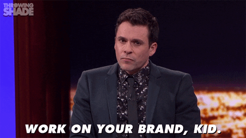
What IS business branding?
View Article
The no-design design guide to email templates
View Article
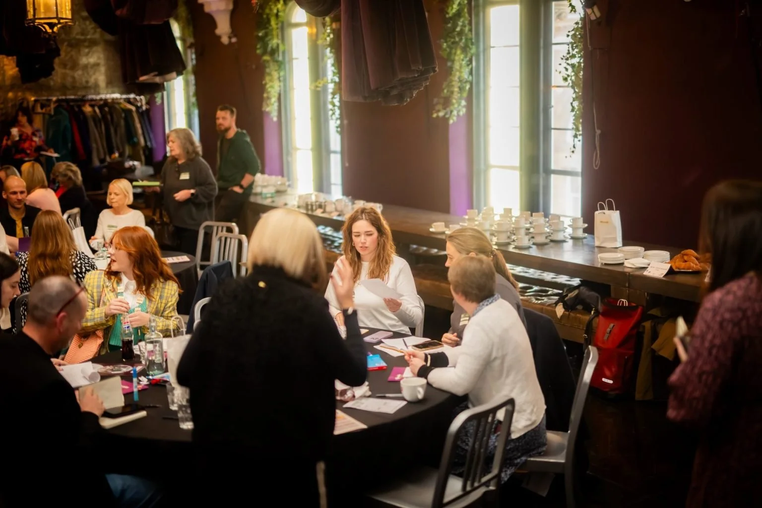
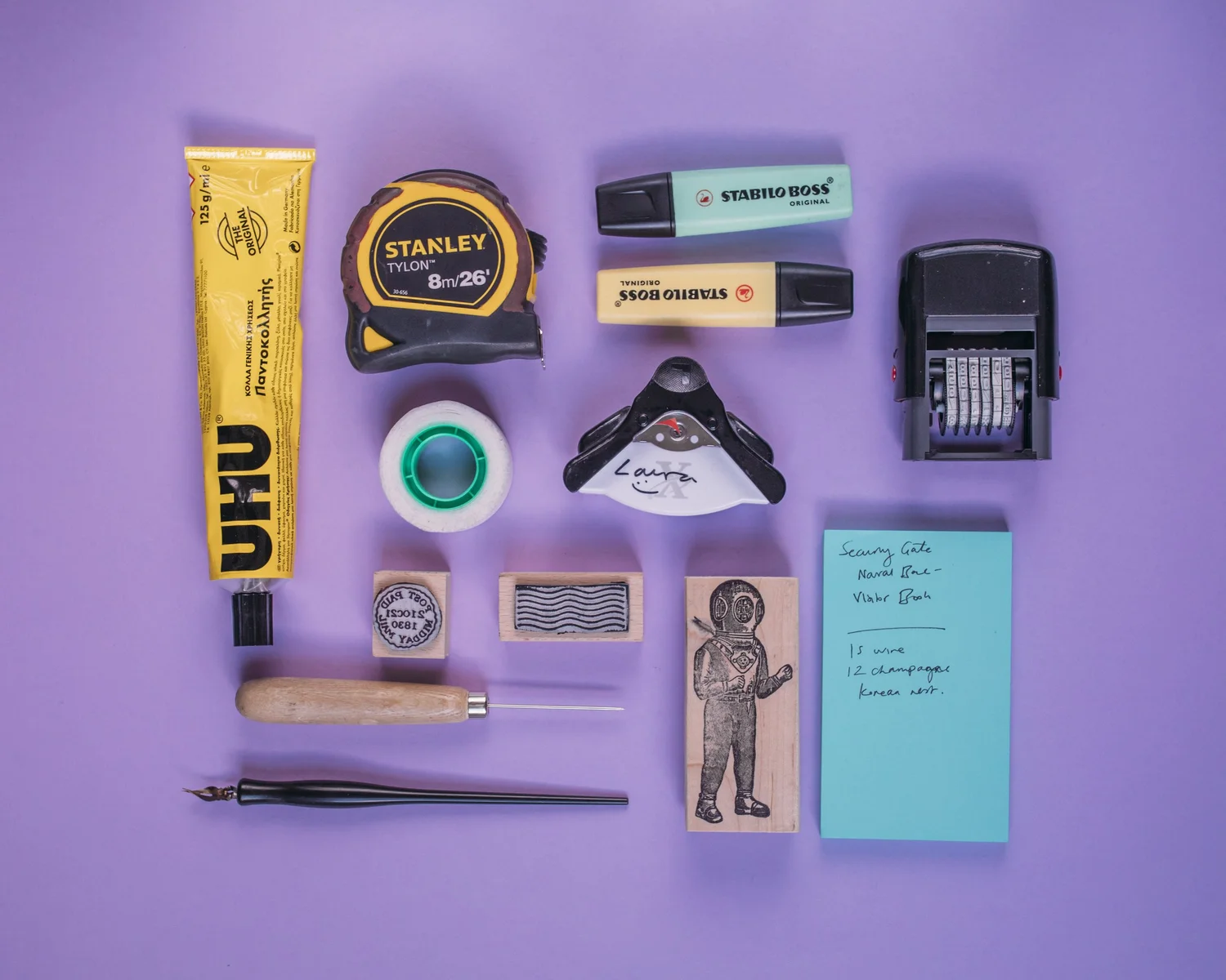
An Interview with Laura Whitehouse Founder of Mighty Fine Design
View Article
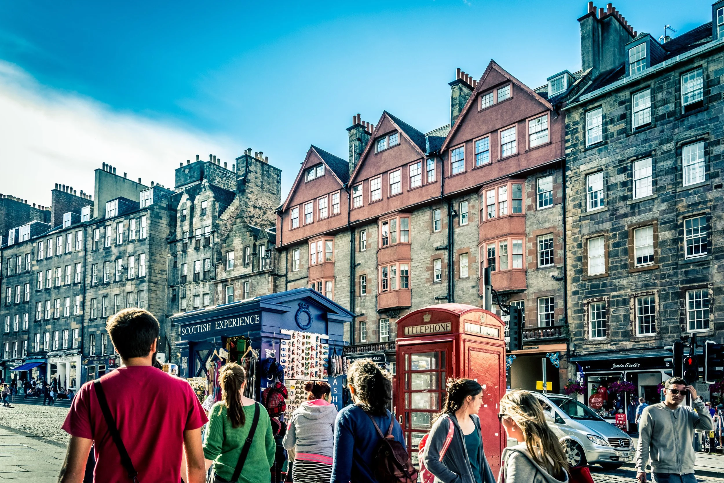
Five rules to nail your Edinburgh Fringe poster design
View Article
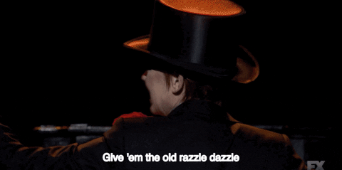
🎵 All I want for Christmas is a new brand 🎵
View Article
How to go freelance (and stay that way)
View Article
No freelancer is an island
View Article
Is Canva the Comic Sans of the design world?
View Article
Interested in the BTS of Film & TV? Give us a listen!
View Article