Words & Design
Whether you’re putting on an energetic one-person play, informing people about how to house-train rabbits, or encouraging clicks on your article of the top ten names for Oasis tribute bands (Oas-ish comes in first in case you’re wondering), the job of design is to communicate. Design needs to carry a message. This message is made up of two equal parts: the visual and the words that accompany it. And just like a Brexit voter and your family Christmas dinner, whilst you can have one without the other, they’re much more likely to cause a scene when put together.

Strong design carves the way for the copy to hammer home the message, and without an immediate strong visual it’ll be harder to communicate what you're trying to say. The same is also true the other way around. Whilst people may be drawn to good design, if the copy that accompanies it is weak, people will be less inclined to stick around.
I’m a designer that has dabbled in writing, and have all the classic nods on my CV to prove it. If you lurk around the corners of the internet I’m pretty sure you'll find a scathing review I wrote for the local paper aged 15 about Lloyd Webber’s Love Never Dies (sorry Andrew), and a swooning piece about an album that ‘spoke to my soul’ and ‘made me soar’ (I die). My degree in Archaeology and Anthropology meant I cracked out about 9000 words a fortnight, usually hastily written over breakfast and sponsored by Total Panic and Why Didn’t I Do This Earlier, and audiobooks accompany me throughout most of my day. You could say I have a healthy appreciation for words. And most of all I love the way they interact with design. When the two work together, baby it’s like firework night. But is one more important than the other in communicating a message? And what are the pitfalls designers usually fall into when laying out copy?

I’m lucky enough to work surrounded by brilliant wordsmiths on a near-daily basis. They make recycling leaflets for the council sound downright sexy, and come up with ideas like breaking into University Parks and pretending to hunt a vampire*. It’s hard to underestimate the importance of copy when the two people who possibly love it most in the world sit opposite you.
Self-described ‘silver-tongued storyteller and geekish lover of words’ Bethany Joy is one of them. Curator of the How To Find Your Brand Voice workshop, Beth studied English Lit and Philosophy at university, has had jobs in communications and in the Charity sector, and now works as a copywriter, both freelance and part-time for One.
I was curious about how writing for a client differs from designing for them, and in many ways they sound similar. When Beth begins writing anything, she asks a lot of questions: who’s it for, where is it going to appear, what structure will it take, how much room will she be given. She slips off her shoes, and tries to fit into the clients’: squeezing them on to find out who they are, how they want to position themselves, and trying to forget all about her own in the process. She helps other people’s great ideas to be communicated better. This is where copywriting differs from content creation and writing in general: the ideas are not her own, but Beth polishes what she’s given and produces a different voice each time.
The process of creating both sounds similar – often the beginnings of Beth’s writing start with with ‘blahs’ and ‘xyz’s’ shoved all over the place, sentences that describe what they should say rather than saying it, to help her to organise her thoughts. This is comparable to the first hour or so of something I design, which usually involves me hiding my screen, turning the brightness down low, tilting the monitor away so nobody can see what abhorrent things I’m creating whilst I wait for it to all slot together and sit right.
We have a chicken and egg situation on our hands. From a copywriter’s perspective, Beth agreed that design and words should work together more than they usually do: slotting together like a neat jigsaw where possible. I for one have definitely been guilty of not reading copy before slotting it into a design. Most designers use Lorem Ipsum, a placeholder text that looks like Latin and covers most basic letter and word forms, when the actual copy is not available. So, either the copy or the design need to come first, but it’s important to consider the two together once they’re both completed. If you don’t read what you’re laying out, even if this comes post-design, the purpose of what's communicated could be lost, and you could be left with a half-hearted message.
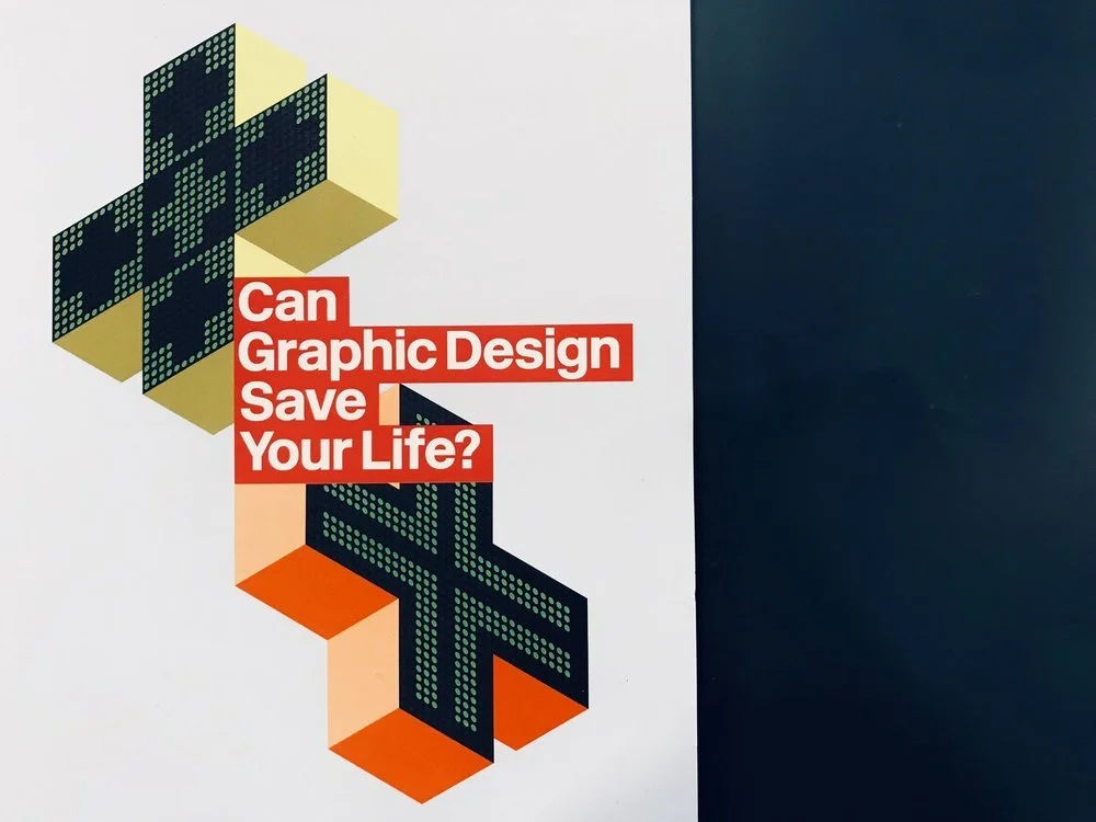
The new exhibition at the Wellcome Collection, which I visited last month, had some excellent examples of pairing cracking copy with delightful design. Can Graphic Design Save Your Life was curated by graphic designer Lucienne Roberts and design educator Rebecca Wright, and demonstrates the role design plays in healthcare. From instructional posters about illnesses, directional signs for hospitals, to reassuring post-diagnosis booklets. Design in medicine is ‘both practically and emotionally beneficial […] helping patients to feel at ease and feel safe’. Simply put, design, and the words that accompany it, can help people to feel better.
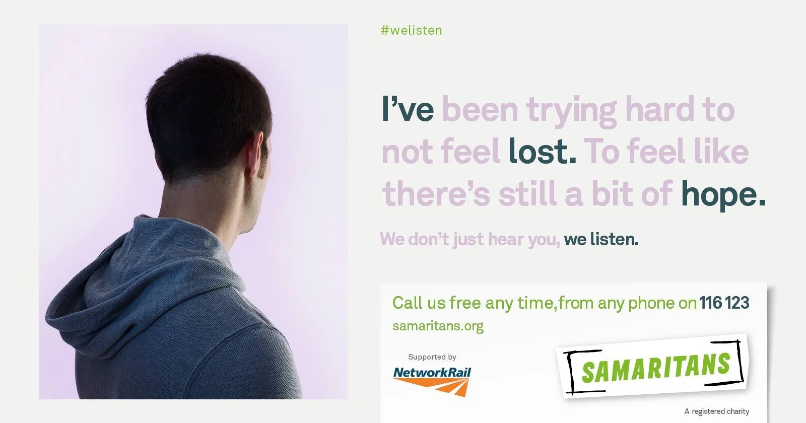
One particular part of the exhibition that stood out to me was the Samaritans We Listen campaign, above, designed by MullenLowe London. This award-winning campaign was created in partnership between the Samaritans, a 24/7 helpline for those struggling with anxiety and depression, and Network Rail, who are particularly affected by high rates of male suicide in the UK. The We Listen campaign contained striking and hidden messaging to encourage the public to seek help before taking any drastic steps. The design here focussed on soft colours, and images of individuals with their backs turned, anonymous but recognisable. The faded out words create two layers of meaning to the copy, making this simple design particularly emotive and encouraging engagement. The image gives a human side to the words, and whilst the words would work by themselves, it’s the visual play on which ones fade out that give them the overall meaning.
The point is: you’re making something that’s trying to communicate something. If you’re trying to do that without considering all the elements, including design and copy, you’re missing a trick. Designers should strive to read the text they're given, or realistically skim read it if it's hefty, and copywriters should be flexible on their craft to ensure the two sit together comfortably. And then we can all hold hands and have a lovely roast dinner together... teamwork makes the dream work guys.
(*Irrelevant to writing copy, just a fun fact. Also completely off record - I did not say this)